#Preloader Animation using HTML and CSS
Explore tagged Tumblr posts
Visit Tumblr Blog
Explore Tumblr blogs with no restrictions, modern design and the best experience.
Last Seen Tumblr Blogs


Fun Fact
The “We are the 99%” Tumblr blog became the slogan for the Occupy Wall Street movement.
Text

Preloader Animation using HTML and CSS
#Preloader Animation using HTML and CSS#preloader#css loader#css animation#animation#html css animation#html css#frontend#css#html#css effects#css animation examples#css animation tutorial#neduzone
0 notes
Text
Explore 35 Creative CSS Book Effects

Immerse yourself in a curated collection of free HTML and CSS book effect code examples, featuring 3D, animation, flip, layout, and more. Our June 2021 update includes 9 exciting new additions, offering you a treasure trove of creative ways to enhance your web design with captivating book-inspired effects. Discover, customize, and elevate your website's aesthetics with these mesmerizing animations. Author Yoann November 25, 2021 Links Demo and Code Download Made with HTML / CSS About a Code Textbook CSS Effect Dive into the world of a singular animation detail—an engaging CSS effect that turns your text into a virtual textbook. Explore creative ways to add this unique visual element to your web design for an enhanced user experience. Compatible browsers: Chrome, Edge, Firefox, Opera, Safari Responsive: no Dependencies: - Author Alina November 23, 2021 Links Demo and Code Download Made with HTML / CSS About a Code 3D CSS Book Explore the world of a singular 3D CSS book effect, transforming your web design into an immersive and captivating visual experience. Discover how to incorporate this unique animation detail into your website for a dynamic touch. Compatible browsers: Chrome, Edge, Firefox, Opera, Safari Responsive: no Dependencies: - Author Callum Wylie November 23, 2021 Links Demo and Code Download Made with HTML / CSS (SCSS) About a Code CSS Book Preview Immerse your website in the captivating world of a singular book preview CSS effect. Explore how to create an engaging visual experience that allows users to preview content, adding an interactive touch to your web design effortlessly. Compatible browsers: Chrome, Edge, Firefox, Opera, Safari Responsive: no Dependencies: -

Author MOZZARELLA November 22, 2021 Links Demo and Code Download Made with HTML / CSS About a Code Aged Paper Reader - Responsive Immerse yourself in a singular animation detail—an auto-overflow reader with the charm of aged paper styling. Explore this creative way to enhance your reading experience on a responsive platform, adding a touch of nostalgia to your web design. Compatible browsers: Chrome, Edge, Firefox, Opera, Safari Responsive: Yes Dependencies: - Author Jon Kantner October 11, 2021 Links Demo and Code Download Made with HTML / CSS About a Code Book Preloader Animation Elevate your website with a captivating singular animation detail—a looping 3D-ish book animation designed to function as a preloader. Enhance user engagement and anticipation with this creative web design element. Compatible browsers: Chrome, Edge, Firefox, Opera, Safari Responsive: no Dependencies: - Author Saranya Mohan December 17, 2020 Links Demo and Code Dribble Demo Download Made with HTML / CSS (SCSS) About a Code 3D eBook Flip Animation Immerse your web design with a captivating singular animation detail—a 3D eBook flip animation. Explore creative ways to add this dynamic visual effect to your website, providing users with an engaging and interactive experience that mimics flipping through a digital book. Compatible browsers: Chrome, Edge, Firefox, Opera, Safari Responsive: yes Dependencies: - Author Amit Sheen August 3, 2020 Links Demo and Code Download Made with HTML / CSS (SCSS) About a Code CSS Page Turning Effect Discover a captivating singular animation detail—a CSS effect that mimics the turning of pages in a book. Explore this creative element to add an engaging and interactive touch to your web design, enhancing user experience with visual flair. Compatible browsers: Chrome, Edge, Firefox, Opera, Safari Responsive: no Dependencies: -
Author Lynn Fisher July 16, 2020 Links Demo and Code Download Made with HTML / CSS (Stylus) About a Code Coffee Table Book Image Effect with CSS Transform your images into a captivating coffee table book with this singular animation detail created using CSS. Discover how to add a containing div to achieve this unique visual effect, enhancing your web design effortlessly. Compatible browsers: Chrome, Edge, Firefox, Opera, Safari Responsive: no Dependencies: -

Author Rajni Gulati July 3, 2020 Links Demo and Code Download Made with HTML / CSS (Stylus) About a Code CSS Book Effect Immerse your web design in the captivating world of a singular CSS book effect, adding a unique and engaging visual element to your website. Explore creative ways to enhance your user experience with this dynamic animation detail. Compatible browsers: Chrome, Edge, Firefox, Opera, Safari Responsive: no Dependencies: -

Author Poulami Chakraborty June 19, 2020 Links Demo and Code Download Made with HTML / CSS (Stylus) About a Code Single Div Book Effect Explore the mesmerizing world of a single div book effect, a singular animation detail that brings dynamic depth to your web design. Discover creative ways to incorporate this unique visual element into your website for an engaging user experience. Compatible browsers: Chrome, Edge, Firefox, Opera, Safari Responsive: no Dependencies: - Author Nayara Alves June 18, 2019 Links Demo and Code Download Made with HTML / CSS (SCSS) About a Code CSS-Only Book Preview Immerse your web design with a singular CSS-only book preview animation. Explore creative possibilities to showcase your content as a virtual book, enhancing your website's user experience effortlessly. Compatible browsers: Chrome, Edge, Firefox, Opera, Safari Responsive: no Dependencies: -

Author Mina Mounir June 6, 2020 Links Demo and Code Download Made with HTML / CSS (SCSS) About a Code 3D Book Design Immerse your web design in the world of 3D with this captivating singular animation detail—a 3D book design. Explore creative possibilities to incorporate this unique visual element into your website for an engaging user experience. Compatible browsers: Chrome, Edge, Firefox, Opera, Safari Responsive: no Dependencies: -

Author Tim Holman February 19, 2020 Links Demo and Code Download Made with HTML / CSS About a Code 3D Book Design Immerse your web design in the world of 3D with this captivating singular animation detail—a 3D book design. Explore creative possibilities to incorporate this unique visual element into your website for an engaging user experience. Compatible browsers: Chrome, Edge, Firefox, Opera, Safari Responsive: no Dependencies: - Author Jamie Coulter June 6, 2019 Links Demo and Code Dribble Demo Download Made with HTML / CSS About a Code Magazine-Style CSS Layout Transitions Create a captivating singular animation detail with a pure CSS magazine-style layout featuring smooth transitions. Explore the creative possibilities of this unique visual enhancement to elevate your website's aesthetics and user experience seamlessly. Compatible browsers: Chrome, Edge, Firefox, Opera, Safari Responsive: no Dependencies: - Author Jamie Coulter June 6, 2019 Links Demo and Code Download Made with HTML / CSS About a Code George Orwell's 1984 Book Cover Hover Effect Explore a captivating singular animation detail—a hover effect for George Orwell's iconic "1984" book cover, crafted in HTML, SVG, and CSS. Immerse your web design with this creative touch for a unique and engaging user experience. Compatible browsers: Chrome, Edge, Firefox, Opera, Safari Responsive: no Dependencies: - Author Rob March 20, 2019 Links Demo and Code Download Made with HTML / CSS About a Code Shiny Book Reveal Uncover a captivating singular animation detail—a 3D hover effect that opens a virtual book, revealing its synopsis. Elevate your web design with this creative and interactive element, adding a touch of magic to your content presentation. Compatible browsers: Chrome, Edge, Firefox, Opera, Safari Responsive: no Dependencies: -

Author Dhanish July 30, 2018 Links Demo and Code Download Made with HTML / CSS About a Code CSS Flipping Book Effect Explore the captivating world of a singular CSS flipping book effect. Transform your web content into an interactive and engaging virtual book with this creative animation detail. Add depth and visual interest to your web design effortlessly. Compatible browsers: Chrome, Edge, Firefox, Opera, Safari Responsive: - Dependencies: - Author Yancy Min July 14, 2018 Links Demo and Code Dribble Demo Download Made with HTML / CSS About a Code CSS Book Hover Animation Elevate your web design with a captivating singular animation detail—a pure CSS book hover animation. Explore the creative potential of this unique visual enhancement for an engaging and interactive website experience. Compatible browsers: Chrome, Edge, Firefox, Opera, Safari Responsive: yes Dependencies: -
Author NVC June 7, 2018 Links Demo and Code Download Made with HTML / CSS (SCSS) / JavaScript About a Code Book Group User Interface Create an engaging singular animation detail—a book group user interface using HTML, CSS, and JS. Explore how to craft this unique visual element for your web design, adding interactivity and creativity to your website effortlessly. Compatible browsers: Chrome, Edge, Firefox, Opera, Safari Responsive: - Dependencies: jquery.js

Author Lyna Nguyen March 13, 2018 Links Demo and Code Download Made with HTML / CSS About a Code HTML & CSS Book Animation Immerse your web design in the captivating world of a singular book animation crafted with HTML and CSS. Explore the creative possibilities of this unique animation detail, adding a dynamic visual element to your website with ease. Compatible browsers: Chrome, Edge, Firefox, Opera, Safari Responsive: - Dependencies: -
Author Anna Sabatini March 13, 2018 Links Demo and Code Download Made with HTML / CSS About a Code 3D CSS Book Explore a remarkable 3D CSS book, crafted exclusively with HTML and CSS. This singular animation detail comes to life with CSS animations on mouse-hover, adding an engaging and interactive element to your web design with simplicity and style. Compatible browsers: Chrome, Edge, Firefox, Opera, Safari Responsive: - Dependencies: -

Author Robert Bunnysman January 5, 2018 Links Demo and Code Download Made with HTML / CSS About a Code 3D CSS Book Experience a captivating 3D flip hover effect, transforming your web content into a virtual book of congratulations. Explore this singular animation detail to enhance your web design and engage your audience with interactive and immersive visuals. Compatible browsers: Chrome, Edge, Firefox, Opera, Safari Responsive: - Dependencies: -

Author Aysha Anggraini September 30, 2017 Links Demo and Code Download Made with HTML / CSS (SCSS) About a Code 3D CSS Book Discover a fantastic singular animation detail—a comic book style layout created with CSS Grid. Explore how to infuse your web design with dynamic visual storytelling reminiscent of comic books, enhancing your website's aesthetics effortlessly. Compatible browsers: Chrome, Edge, Firefox, Opera, Safari Responsive: - Dependencies: -
Author Erin E. Sullivan August 25, 2017 Links Demo and Code Download Made with HTML / CSS About a Code 3D CSS Book Experience a responsive skeuomorphic book layout that's brimming with delightful features. Read the full article
0 notes
Text
Instant Artist Software Download

Download free print artist software (Windows).
Rhinestone Design Software: 3 Programs Unleash your Inner Artist.
Download Graphics - Software and Games.
Print Artist Platinum - Free download and software reviews - CNET Download.
UDraw Studio: Instant Artist - Xbox Games Store.
Autodesk Instant Artist Software - Free Download Autodesk... - WinSite.
Instant Artist shareware, demo, freeware, software downloads.
Downloads - InstantWP.
Instant Artist Software Free Downloads - Shareware Central.
Free Download Instant Artist Software Setup - safasstory.
Print Artist Platinum 25 | Print Software | Nova Development.
Instant Photo Artist (free version) download for PC.
Professor Franklin's Instant Photo Effects - Free Download.
Download free print artist software (Windows).
Download Instant Artist 2.0 Upgrade for Windows 2.0 by The Pixellite. Instant Artist, later renamed to Print Artist, is a greeting card and sign creation program that uses vectorized graphics. It was created by The Pixellite Group, the original authors of The Print Shop, and published in 1992 by Autodesk. It was later sold by Sierra On-line. Instant Artist Software For Windows 10 Print Artist Platinum 24 is a powerful Print Projects tool for home, business, and school. This free download is a standalone installation setup of Print Artist 24 for Windows 32bit and 64bit..
Rhinestone Design Software: 3 Programs Unleash your Inner Artist.
Instant Artist Software Instant Gallery Maker v.2.0 Instant Gallery Maker will allow you to quickly and easily create professional-looking web image galleries ready to be published on the Web. You don't need to know anything about HTML and CSS - this easy-to-use tool will do everything for you. File Name:InstantGalleryMakerS. Dec 05, 2008 · Download Professor Franklin's Instant Photo Artist for Windows to take an ordinary photo and turn it into exciting work of art.
Download Graphics - Software and Games.
Download free print artist software; Download free print artist software. Most people looking for Free print artist software downloaded: Print Artist Gold. Download. 3.8 on 97 votes. Print Artist Gold is a program that lets you produce print projects for your home, school or business. Fast drawing for everyone. AutoDraw pairs machine learning with drawings from talented artists to help you draw stuff fast.
Print Artist Platinum - Free download and software reviews - CNET Download.
All Presets included with Studio Artist 5.5; Animation Video Auto-Rotoscoping; Interactive Computer Generated Animations Self-Animating Kaleidoscopic and Abstract Effects; The Vectorizer Instant Photo to Vector Art; Instant Abstract Art and Interactive Spiro Art Generator.
UDraw Studio: Instant Artist - Xbox Games Store.
LINE Doctor is a telemedicine service that lets users book appointments, speak with a doctor over video call, and pay for consultations on the LINE app. Receive medical consultations at home when you don't have time to visit a hospital or want to avoid the crowd. Verdict: Clip Studio Paint is one of the most popular professional drawing tools for PC. The program was designed for creating illustrations, animations, manga, and comics. Currently, near 5 million people use this program. Many professional artists and illustrators prefer using this free drawing software as it provides superior flexibility and freedom. Create eCovers & Software Boxes: 3D eCovers. Easily take the graphics you have created using Instant Banner Creator, and convert them into 3D eCovers or software boxes. This powerful script even comes preloaded with cool templates ready for use.
Autodesk Instant Artist Software - Free Download Autodesk... - WinSite.
Auto-Tune Artist (formerly Auto-Tune Live) is designed to meet the demanding needs of working musicians, producers, and live sound engineers. It includes all of the advanced real-time pitch correction features of Auto-Tune Pro, and is optimized for low latency performance on stage or in the studio.. This version of Auto-Tune is also packed with powerful new features and enhancements, starting. Jun 13, 2022 · Q #1) What is drawing software? Answer: It is a computer program used to create art. These programs come with a variety of features to create and edit images. Q #2) Which software is best for drawing? Answer: There isn’t a particular software that is best for drawing. The “best” software is the one that provides users with all the.
Instant Artist shareware, demo, freeware, software downloads.
QuickBooks Desktop Pro Plus 2022 Accounting Software for Small Business 1-Year Subscription with Shortcut Guide (PC Download) 312. $2499. Adobe Acrobat Professional DC | Create, edit and sign PDF documents | 1-month Subscription with auto-renewal, PC/Mac. 1,392. $9999. Check them out below 🙂. * All links will open in a new tab. MAuto Pitch (Mac & Windows) Super easy to use Pitch Correction Plugin, with built in scales and even Formant Shifting. DOWNLOAD. Graillon 2 (Mac & Windows) A Pitch Shifting and Correction Plugin (Free version of a more complex Live Voice Manipulator Plugin) DOWNLOAD. GSnap (Windows). Instant Artist Software Download Go to 1 2 Freeware page 1 Instant Backup Software 2.0 Instant Backup Software is a simple backup software solution to help you backup your important document, work, music, video or other files. Backup to an external hard drive, a USB thumb or flash drive or to a network shared folder. Specify your source... 1.6 MB.
Downloads - InstantWP.
Always where you need it. Keep your inspiration forever at hand by setting PureRef to always stay on top of your workspace. With its minimalistic interface it takes up just as much space as you want it to. Discover your inner artist and unleash your imagination with this easy-to-use and easy-to-learn art creation experience available only on the uDraw GameTablet™! Join Remmy, the game’s new 3D animated host, on a journey spanning 15 unique art lessons and interactive tutorials on a variety of painting techniques. May 01, 2022 · Instant Artist (IAW.EXE). Print Artist is unlike any print software you’ve ever owned — unparalleled quality and unprecedented ease of use together.
Instant Artist Software Free Downloads - Shareware Central.
Alongside 110+ million songs, Napster is home to hundreds of thousands of official music videos. Whether you’re streaming on demand or listening offline, enjoy all content ad-free. You can download the current version of InstantWP below: For Windows: InstantWP Current Windows Release For macOS: InstantWP Current macOS Release You can download. Presonus VST/AU/REWIRE Software Plug-In Download. Presonus VST/AU/REWIRE. $79.95. or 4 interest-free payments of $19.99 with ⓘ. Add to Cart. Details. Add VST2, VST3, and AudioUnits support to Studio One Artist (Versions 3 and 4) and run any compatible plug-ins or virtual instruments! Also adds Rewire support for live integration with other.
Free Download Instant Artist Software Setup - safasstory.
PCB Artist is the most active PCB layout software on CNET's D with over 270,000 downloads. Live Tech Support If you need assistance please email / call us for Live Technical Support from 8:00 AM - 5:30 PM MST.
Print Artist Platinum 25 | Print Software | Nova Development.
Turn playable loops into professional results with ease thanks to Chromatic—the only DAW instrument designed for artists, by artists. Try Chromatic free then unlock the full library for just $9.99/mo.
Instant Photo Artist (free version) download for PC.
Instant Artist, later renamed to Print Artist, is a greeting card and sign creation program that uses vectorized graphics. It was created by The Pixellite Group, the original authors of The Print Shop, and published in 1992 by Autodesk. It was. Instant Software Store / Simple Software Support holds themselves out as "... Malwarebytes Professional indicated it was malvertising. I decided not to proceed with the download and dispute the credit card charge. Report abuse Report abuse. Type of abuse. Harassment is any behavior intended to disturb or upset a person or group of people..
Professor Franklin's Instant Photo Effects - Free Download.
Trusted Windows (PC) download Instant Photo Artist 2.2.0.1. Virus-free and 100% clean download. Get Instant Photo Artist alternative downloads. Professor Franklins Instant Photo Effects lets you add professional photo effects to your pictures. Professor Franklin's Instant Photo Effects is a tool with a pretty self-explanatory name - it. Download StitchArtist Level 2 Software by Briton Leap and many other machine embroidery and quilting softwares at Ann The Gran. We provide FREE Demo downloads and meet or beat any competitor price.... Sign up today and receive instant access to 1000+ Free Designs! Enter a valid email address. SIGN-UP FOR FREE No thanks, I don't like free stuff.
See also:
1 note
·
View note
Video
youtube
Create Animated Loader like Google by HTML, CSS & JQuery | webkitcodingyt
Hello friends Today in this video i will create an awesome and animated Preloader like Google Preloader by using html & css only in very easy way if you have any doubt you can ask me in comment box and also follow us on the social media that given below
➡️Instagram : https://www.instagram.com/WebKitCoding ➡️Facebook Page : https://www.facebook.com/WebKitCoding ➡️Twitter : https://mobile.twitter.com/WebKitCoding
#html#html5#css#css3#csseffects#htmlcss#javascript#jquery#loader#cssloader#screenloader#webdesign#webdevelopment#websitedesign#webkitcodingyt
0 notes
Text
Best WordPress Speed Optimization Tools & Plugins
Website speed is one of the key factors for your site`s success and growth and fast-loading websites are preferable by both the search engine and users. You are required to optimize your website speed for better rankings and performance as an owner of the website because if your website is smooth and fast-loading, then your audience will love to visit and also they like to buy some products from your website. If your website speed is slow then your audience will leave your site and by the fast speed, you will get more growth sales and traffic on your website. If you run your website with WordPress then it offers various WordPress Plugins and installing that makes speed optimization tasks convenient.
To make your website fast-loading and to improve speed of your website then take this WordPress website development service that will help you to achieve your target.

Why to Choose Speed Optimization Tools & Plugins?
You have to choose speed optimization Plugins & tools to improve the user experience and for the SEO rankings. Google always gives the best and better rankings to people who have good speed and if your website doesn`t load fast then your users will abandon the site because website speed is directly proportional to a good conversion rate.
The Following Is the Various Plugins & Tools for WordPress Speed Optimization
A) All-In-One WordPress Speed Optimization Plugins
1 WP Rocket
It is one of the most popular Plugins to speed up your WordPress site and also it is user friendly. It is web page caching, database optimization, cache preload, image lazy loading, Java Scripts deferring, improves SEO rankings of your website and also advanced caching rules, etc.
2 WP-Optimize
It is an all-in-one WordPress performance Plugins that clean your database. It is minifying codes and deferring java scripts, image lazy loading, caching web pages for faster rendering, compressing images to reduce image sizes, browser caching, and also combining and minifying CSS files, etc.
B) Caching WordPress Plugins for Speed Optimization
3 WP Super Cache
It is one of the most popular and widely used for optimizing your website speed by caching web pages. It is compatible with CDN, simple and easy to configure, serve static HTML file, cache preload, it is expert and provides the fastest caching, WP-Cache caching, and also support the multiple caching types, etc.
4 LiteSpeed Cache
It is a popular WordPress caching Plugins and it offers a server-level cache and it has over a million active installations. It also offers a collection of optimization features. It is a database optimizer and cleaner, browser cache supporter, API system for easy cache integration, page speed score optimization, and also easy to understand integration and separate caching of desktop and mobile views, etc.
C) WordPress Image Compression Plugins
5 Imagify
It has more than 400 thousand active installations and also It is another great image optimization plugin. By installing this plugin you can easily optimize all your images automatically. It directly resizes your images, converts Web Page images for free, is compatible with WooCommerce, normal and aggressive also ultra, etc.
6. TinyPNG
It is an online tool useful for image compression for your website and it is very simple to use. It also works with both PNG and JPG images and it is just a tool. It is supported by all browsers and also mobile devices. It can compress 20 images at a time and can optimize your animated PNG as well.
1 note
·
View note
Text
Explore 24 Dynamic CSS Blob Effects
Dive into a carefully curated collection of free HTML and CSS blob effect code examples sourced from Codepen, GitHub, and other reputable resources. This November 2021 update brings 9 exciting new additions to help you infuse your web design with unique and eye-catching blob effects. Discover, customize, and enhance your website's visual appeal with these captivating animations. Related Articles: - Explore 15+ Interactive CSS Bubbles for Your Web Projects Author Temani Afif April 8, 2022 Links Demo and Code Download Made with HTML / CSS About a Code CSS Blob Checkbox Dive into the world of CSS blob effects with this singular animation detail. Explore how to create a dynamic and eye-catching blob checkbox using CSS, adding a unique touch to your web design effortlessly. Compatible browsers: Chrome, Edge, Firefox, Opera, Safari Responsive: no Dependencies: - Author Fabrizio Calderan March 22, 2022 Links Demo and Code Download Made with HTML / CSS About a Code Blob Effect Immerse your web design with a captivating blob effect, a singular animation detail that adds a dynamic and eye-catching touch to your website. Explore the creative potential of blob animations for a unique visual experience. Compatible browsers: Chrome, Edge, Firefox, Opera, Safari Responsive: Yes Dependencies: - Author Temani Afif January 6, 2022 Links Demo and Code Download Made with HTML / CSS About a Code The Blob II Step into the world of "The Blob II," a singular animation detail that brings a unique and dynamic element to your web design. Explore the creativity and innovation behind this captivating web animation. Compatible browsers: Chrome, Edge, Firefox, Opera, Safari Responsive: no Dependencies: -

Author NANOUU December 16, 2021 Links Demo and Code Download Made with HTML / CSS About a Code Drop Experience the magic of "Drop," a singular animation detail that adds depth and intrigue to your web design. Explore the creative possibilities of this captivating visual element. Compatible browsers: Chrome, Edge, Firefox, Opera, Safari Responsive: no Dependencies: - Author TheDevEnv December 8, 2021 Links Demo and Code Download Made with HTML / CSS About a Code CSS Blob Animation and Glassmorphism Explore the fascinating combination of blob animation and glassmorphism achieved with CSS. Dive into this singular animation detail to add a dynamic and sleek visual element to your web design effortlessly. Compatible browsers: Chrome, Edge, Firefox, Opera, Safari Responsive: yes Dependencies: - Author Jon Kantner September 29, 2021 Links Demo and Code Download Made with HTML / CSS About a Code RGB Blob Preloader Experience the mesmerizing RGB Blob Preloader, a singular animation detail that enhances your web design with dynamic visual appeal. Explore how this creative element adds a unique touch to your website's loading process, captivating your audience from the start. Compatible browsers: Chrome, Edge, Firefox, Opera, Safari Responsive: yes Dependencies: - Author Temani Afif June 25, 2021 Links Demo and Code Download Made with HTML / CSS About a Code Pure CSS Blob Effect with Zero HTML Elements Discover the enchanting world of a pure CSS blob effect created without a single HTML element. Dive into this singular animation detail and elevate your web design with dynamic and eye-catching visuals, all achieved with the power of CSS alone. Compatible browsers: Chrome, Edge, Firefox, Opera, Safari Responsive: yes Dependencies: - Author Shrinath Prabhu May 19, 2021 Links Demo and Code Download Made with HTML / CSS About a Code Animated Blobs Immerse your web design with the magic of animated blobs, a singular animation detail that adds dynamic and eye-catching visual effects. Explore the creative possibilities of blob animations for a unique web experience. Compatible browsers: Chrome, Edge, Firefox, Opera, Safari Responsive: yes Dependencies: - Author Colleen Lohr March 4, 2021 Links Demo and Code Download Made with HTML / CSS (SCSS) About a Code Animated Neumorphism Blob Checkbox Explore a unique experiment with checkboxes, where version one showcases a simple reveal animation upon check to unveil the captivating animated blob. Immerse your web design in the innovative world of neumorphism with this singular animation detail. Compatible browsers: Chrome, Edge, Firefox, Opera, Safari Responsive: no Dependencies: - Author Adam Dipinto November 29, 2019 Links Demo and Code Download Made with HTML / CSS (SCSS) About a Code Social Card Hover Elevate your web design with the "Social Card Hover," a singular animation detail that adds an interactive and engaging element to your website's social media cards. Explore the magic of hover effects for a captivating user experience. Compatible browsers: Chrome, Edge, Firefox, Opera, Safari Responsive: no Dependencies: - Author Juan Pablo February 27, 2019 Links Demo and Code Download Made with HTML / CSS About a Code Blobs, Grids, and Viewport Units Explore a fascinating demo showcasing the explicit placement of blobs on a grid using viewport units. Dive into this singular animation detail and learn how to create dynamic web layouts that captivate your audience. Compatible browsers: Chrome, Edge, Firefox, Opera, Safari Responsive: yes Dependencies: - Author Amli February 25, 2019 Links Demo and Code Download Made with HTML / CSS About a Code CSS Animated Blobs Text in Multiple Colors Elevate your text design with animated blobs created solely with CSS. Explore this singular animation detail that adds a splash of creativity and dynamic color to your web content effortlessly. Compatible browsers: Chrome, Edge, Firefox, Opera, Safari Responsive: no Dependencies: - Author Jhey February 24, 2019 Links Demo and Code Download Made with HTML (Pug) / CSS (Stylus) About a Code Randomly Generated CSS Lava Lamp Dive into the world of the "Randomly Generated CSS Lava Lamp," where blob characteristics are uniquely crafted on each load using random CSS variables. Experience a different and captivating lamp with every visit, adding dynamic flair to your web design effortlessly. Compatible browsers: Chrome, Edge, Firefox, Opera, Safari Responsive: no Dependencies: - Author Mark February 20, 2019 Links Demo and Code Download Made with HTML (Pug) / CSS (SCSS) About a Code Blended Photo & Gradient Blob Animation Immerse your web design with a mesmerizing animation that combines blended photos and gradient blobs. This singular animation detail, created with border-radius and Unsplash images using SCSS and Pug, adds a dynamic and captivating touch to your website's visuals. Explore the creative possibilities of this unique animation. Compatible browsers: Chrome, Edge, Firefox, Opera, Safari Responsive: no Dependencies: - Author Leena Lavanya February 20, 2019 Links Demo and Code Download Made with HTML / CSS (SCSS) About a Code Animated Blobby Gooey Button Discover the magic of an animated blobby gooey button, a singular animation detail that injects playful and interactive elements into your web design. Dive into this captivating button experience and explore its creative potential for enhancing user engagement. Compatible browsers: Chrome, Edge, Firefox, Opera, Safari Responsive: yes Dependencies: - Author sasi jj February 19, 2019 Links Demo and Code Download Made with HTML / CSS About a Code Dashing Blob Ball Experience the excitement of the "Dashing Blob Ball," a singular animation detail that adds a dynamic and eye-catching element to your web design. Dive into the world of creativity with this captivating web animation. Compatible browsers: Chrome, Edge, Firefox, Opera, Safari Responsive: no Dependencies: - Author MARK February 19, 2019 Links Demo and Code Download Made with HTML (Pug) / CSS (SCSS) / JavaScript About a Code Animated Blob Cursor Elevate user engagement with an animated blob cursor, a singular animation detail that adds a dynamic and interactive element to your web design. Explore how to create this eye-catching feature for a unique browsing experience. Compatible browsers: Chrome, Edge, Firefox, Opera, Safari Responsive: yes Dependencies: - Author Kari Sabine Malmin February 13, 2019 Links Demo and Code Download Made with HTML / CSS (SCSS) About a Code Border Radius Blob Discover the fascinating world of the Border Radius Blob, a singular animation detail that uses CSS properties to create a captivating and visually appealing blob effect. Explore how to implement this creative element into your web design effortlessly. Compatible browsers: Chrome, Edge, Firefox, Opera, Safari Responsive: no Dependencies: - Author Monica Dinculescu January 23, 2019 Links Demo and Code Download Made with HTML / CSS About a Code CSS Morphing Blob Experience the mesmerizing world of a CSS-only morphing blob, a singular animation detail that transforms and captivates your web design effortlessly. Explore the magic of dynamic shapes and fluidity in web animations. Compatible browsers: Chrome, Edge, Firefox, Opera, Safari Responsive: yes Dependencies: - Author Piotr Galor October 15, 2018 Links Demo and Code Download Made with HTML / CSS About a Code Pure CSS Gooey Morph Experience the magic of a pure CSS gooey morph, where SVG is not involved. This singular animation detail primarily animates border-radius, with added effects like opacity and basic transforms, enhancing your web design with captivating visual flair. Compatible browsers: Chrome, Edge, Firefox, Opera, Safari Responsive: no Dependencies: - Author Adam Kuhn June 5, 2018 Links Demo and Code Download Made with HTML (Haml) / CSS (SCSS) About a Code Pure CSS Blob Card UI Immerse your web design in creativity with these pure CSS cards featuring a captivating blob effect. Explore this singular animation detail and learn how to enhance your website's visual appeal effortlessly. Compatible browsers: Chrome, Edge, Firefox, Opera, Safari Responsive: no Dependencies: - Author Cassie Evans April 4, 2018 Links Demo and Code Download Made with HTML / CSS (SCSS) About a Code CSS/SVG Blobby Background Discover the magic of a singular CSS/SVG blobby background, created by harnessing SVG filters and masks for animation. Dive into the world of creative web design with this captivating animation detail, adding an eye-catching visual element to your website. Compatible browsers: Chrome, Edge, Firefox, Opera, Safari Responsive: yes Dependencies: - Author Cassie Evans April 4, 2018 Links Demo and Code Download Made with HTML / CSS (SCSS) About a Code CSS/SVG Blobby Background Discover the magic of a singular CSS/SVG blobby background, created by harnessing SVG filters and masks for animation. Dive into the world of creative web design with this captivating animation detail, adding an eye-catching visual element to your website. Compatible browsers: Chrome, Edge, Firefox, Opera, Safari Responsive: yes Dependencies: - Author Marjo Sobrecaray April 17, 2017 Links Demo and Code Download Made with HTML / CSS (SCSS) / JavaScript About a Code Draggable Blob with Sass Take a deep dive into the world of draggable blobs created using Sass collections. This singular animation detail is an experiment in dynamic animations, adding interactivity and creativity to your web design effortlessly. Explore the possibilities of interactive blobs on your website. Compatible browsers: Chrome, Edge, Firefox, Opera, Safari Responsive: no Dependencies: - Author Marcos Silva February 13, 2017 Links Demo and Code Download Made with HTML / CSS (SCSS) About a Code CSS-Only Blob Animation Immerse your web design with a mesmerizing CSS-only blob animation, a singular animation detail that adds dynamic flair to your website effortlessly. Explore the creative possibilities of this unique visual effect for an engaging user experience. Compatible browsers: Chrome, Edge, Firefox, Opera, Safari Responsive: no Dependencies: - Read the full article
0 notes
Text
What are the best open source app development software solutions?
The age of smartphones has led to mobile apps being developed. Ios apps flourish today, whether for personal use or business purposes. The market has become highly competitive with the production of more and more smartphone applications daily. This the rivalry has led to a quicker and better choice of the right platform for apps.
Consider the mobile app development frames and features which are essential for open source testing. This will encourage you to think when you decide to create a stunning mobile app then hire the best Mern stack programmers.

BuildFire.js
BuildFire.js is a cross-platform library used on the BuildFire platform to develop custom features. It allows unrestricted personalization of JavaScript only and is one of the easiest frames to implement. Using the existing features of BuildFire.js gives developers the opportunity, by leveraging any existing 45 + open-source plugs, to shorten 80 per cent of the app development phase and concentrate simply on the personalised feature required.
Framework 7
Framework 7 used to be just iOS, but now also offers Android support. If you want to develop an app that even on Android looks and feels like a clean iOS app, then Framework 7 is for you.
As long as you already have decent knowledge of HTML, CSS, and JavaScript, it is also very easy to understand. Some of Framework 7 's features include Material Design UI, a custom DOM library, 1:1-page animation, native scrolling, and preloading and caching XHR.
Ionic
Ionic is another best free, open-source mobile application development software often used for hybrid app design. The best thing is that it allows you to create multi-platform apps, including Android app development company in Singapore, iOS, and web — using a single codebase.
Moreover, it offers intuitive UI components that speed up the process of creating an app. Moreover, it can practically be deployed anywhere. Ionic boasts more than 120 native device features, predefined elements and a wide developer community.
jQuery Mobile
Currently over half of all mobile websites use jQuery mobile. It's one of the oldest mobile software tools out there, and has more features than others. The "Swiss army knife of mobile app dev software" has been named.
Although jQuery brings all the well-known JavaScript features to the table, the key responsibility for CSS and HTML lies with the 'Mobile' portion of the upgrade. Although it lacks native-like features or advanced UI, it does compensate for this by being as similar to the dream of "write once, run anywhere."
Mag+
Mag+ is a nifty SDK software that enables developers to build on top of their core components, saving tonnes of coding hours. They also have an iPad app that provides a fast and easy publishing platform to create content that is optimised for mobile use, no code needed.
Xojo
Xojo is a Mac OS X, Microsoft Windows, x86 Linux, iOS, Raspberry Pi and the Web development platform. They also allow you to build native apps and offer Xojo Cloud for fast, stable, and maintenance-free hosting of web apps.
Xamarin
Xamarin is a Software corporation owned by Microsoft. You can build Apps for Android, iOS and Windows with C # codebase. One of the best features of Xamarin is that it enables code sharing in different platforms (aka the creation of mobile applications around the platform). Xamarin also has a cloud service which enables you to test on a variety of devices.
Wrapping Up
The impact of IoT and its large reach has become the engine behind mobile app growth. Instead of downloading software, the Instant Software idea is emerging as a ground-breaking step in the area of app creation today.
In the coming era of many Top product engineering company Hire Mern Stack developers for
software programmes the low-code method will be in tremendous prevalence. Because of strong demand for premium content, almost all content are continually updated and optimised. App development is rising large and so are the technical solutions for the application growth. So go ahead and choose the one that will suit your needs.
Source page-What are the best open source app development software solutions?
0 notes
Photo

24 Best jQuery Image Sliders
Add a full-featured and easy-to-implement jQuery image slider to your website to help you keep the attention of your website traffic.
CodeCanyon offers some of the best jQuery image sliders available on the web for a one-time low payment.
Slider Revolution is one of the best selling jQuery image sliders available on CodeCanyon.
Images are an integral part of any website and should be displayed in a visually appealing way on your website. CodeCanyon will allow you to integrate a beautiful looking jQuery image slider into your website and allow you to visually display your business products, services, and promotions.
The Best jQuery Image Sliders on CodeCanyon
Discover CodeCanyon's massive library of the best jQuery image sliders ever created. With a cheap one-time payment, you can purchase these JavaScript image sliders and have them installed on your website in no time.
Here are a few of the best-selling jQuery image sliders available on CodeCanyon for 2020.
Check out some of the best selling jQuery Image Sliders available on CodeCanyon.
The jQuery image sliders give you the ability to display your business's images in the best way possible. These sliders are feature-rich and are completely customizable so you can fit them to your website's specific theme. Here are a few features that you can expect from these jQuery image sliders.
fully responsive
smooth transitions
lazy load images
parallax effect
Give your users the website experience they deserve. Add one of CodeCanyon's high-quality jQuery image sliders to your website and let your images shine.
Top 20 jQuery Image Sliders (From CodeCanyon for 2020
1. RoyalSlider
Having a touch-friendly and responsive slider for your website is more important now than ever before, and RoyalSlider is both.
Developed with HTML5 and CSS3 best practices, it's a solid choice.
Here are a few of the other royally cool features:
SEO optimized
highly configurable
over 10 starter templates
includes fallbacks for CSS3 transitions
and more
I think the best feature is the modular architecture that gives devs the option to exclude what they don't need from the main JS file, keeping things as lean as possible.
The RoyalSlider is a solid JavaScript slider that should be a nice addition to any web dev's toolbox.
2. Slider Revolution
It's not easy to be "revolutionary" in the slider space. There are only so many options you can make available when it comes to sliders, but the Slider Revolution does a great job trying.
When it comes to jQuery sliders, this one delivers on just about everything you'll want.
The list of features for this slider is long, so I'll just hit the high points:
parallax effects and custom animations
SEO optimized and lazy loading options
add unlimited layers and slides with link options
includes "ready to use" styles and is highly customizable
and much more
The ability to drop in an image, video player embed, and social media source makes Slider Revolution one of the most flexible and customizable options you'll find.
3. LayerSlider
The name doesn't do this jQuery slider justice. Its 200+ 2D and 3D slide transitions will turn some heads.
Some of the notable features include:
skin design PSD template included
13 skins and 3 navigation types
add a fixed image over the slider
SEO friendly and lazy load images
hardware-accelerated CSS3 transitions with jQuery fallback
and more
Like the previous slider, you can drop in just about any content—even HTML5 self-hosted multimedia content.
The LayerSlider brings a lot of action to the slider space and is downright handsome.
4. Rama
This jQuery Slider Plugin animates your image and text slides with transition effects with over 21 different transition effects. The plugin is easy to install and will give your website a fresh new look.
Here are a few notable features for this slider:
unlimited amount of texts, images, and animation combinations
3+1 frames, wallpaper, and icon options
auto thumbnail creation
easy installation
5. All In One Slider Responsive jQuery Slider Plugin
Every slider comes to market with its own unique perspective and provides a solution to whatever slider niche is being targeted.
But not this one.
The All In One Slider Responsive jQuery Slider Plugin is, well, all in one.
I think most web devs and designers have a go-to solution, but at the same time are always on the lookout for something new.
This just might be that something new as it includes:
banner rotator
thumbnails banner
banner with playlist
content slider
carousel
And all of these slider styles include most—if not all—of the features needed in a jQuery slider.
Will the All In One Slider Responsive jQuery Slider Plugin be your all-in-one slider solution?
6. Slice
This responsive jQuery Slider and carousel plugin provides fully functional vertical sliders and carousels in addition to the classic horizontal layouts. All customization options can be set directly in HTML and the plugin comes with 5 pre-styled themes.
Here are a few more features that you can expect with Slice:
parallax effect block
100+ customizable options
10+ ready-to-use examples
lazy and smart image load
Don't miss out on this powerful jQuery image slider. Add it to your website today!
7. Slidea
Slidea brings a powerful and lightweight multipurpose content slider that will instantly make your website more competitive. The simple but effective design gives you and your viewers complete control over the slider.
This jQuery image slider has has the following features:
premade templates
compatible with any front-end framework
autoplay
50+ animation presets
8. jQuery Easing Slider
jQuery Easing Slider gives you the ability to create smooth animations between your images. The sleek and modern design will give your website a fresh new look.
Here are a few notable features for this jQuery image slider.
fixed and responsive layouts
compatible with all major browsers
customizable image size and position
easily customizable HTML and CSS
Download the Easing Slider today!
9. Kreatura Slider Plugin for jQuery
Looking for a slider that is easy to install, has plenty of animation effects, and ready to use templates? Kreatura is the perfect plugin for you then. The responsive design, effects such as parallax, and SEO friendly design make this an incredibly powerful slider.
Here is what users are saying about this jQuery image slider:
"Slider of very good quality that works perfectly." — nac6
10. jQuery Slider Zoom In/Out Effect
This is one of those jQuery sliders that makes you visit the demo before you start reading about the features because you want to know what the "zoom in/out effect" even means.
Think screensaver.
While the effect is fairly slight, the zoom effect in a slider adds a nice touch in a web full of static image sliders.
This slick slider's features include:
CSS3 layer transitions
exit animation parameters for layers
fixed, full width, and fullscreen options
CSS and HTML formatted animated text
and more
While most sliders try to deliver many effects in one package, the jQuery Slider Zoom In/Out Effect slider delivers the Ken Burns effect and delivers it well.
11. Transition Slider
Transition Slider is a unique and innovative slider plugin with stunning looking animations. There is no coding required and the plugin is easy to install. The slider is fully customizable and can be fit to your specific website's theme. Create a simple responsive animated hero block, responsive video background, block with animated layers and animated background, or responsive animated banner with this plugin.
Here is what Fle9ma has to say about this jQuery image slider:
"The slider really enabled me to bring the website to life in a modern and interactive way. And support is simply outstanding. Really worth the money!"
12. Slim Before-After Image Comparison Slider
This jQuery image slider couldn't be easier to install. Simply add one line of CSS and include the plugin javascript file to your documents and that is it! If you are in need of a basic but fully functional image slider then this is your go-to plugin.
Here are a few notable features for this jQuery image slider:
lightweight and simple design
mobile ready (touch-enabled)
customizable via CSS
bootstrap compatible
RTL Support
13. Master Slider jQuery Slider Plugin with Visual Builder
The Master Slider jQuery Slider Plugin with Visual Builder makes building a slider a snap—without sacrificing good looks.
This premium image and content slider offers some really nice hardware-accelerated transitions that will surely catch your eye.
Features include:
smart preloading
built for both mobile and desktop
over 80 ready-to-use sample sliders
masked layer transitions, layer actions, and overlay layers
and more
Master Slider jQuery Slider Plugin with Visual Builder is fully customizable, SEO friendly, and also supports videos. And of course, it comes with a visual builder to make creating sliders easy.
14. HOHOR
HOHOR isn't specifically an image slider but it is still worth a mention in this list. HOHOR is a gallery plugin that can be used as a slider plugin. You can feature as many images as you would like on a web page in masonry and grid formats and have them displayed in different sizes.
Here are a few other key features for this plugin:
dark and light version
fully responsive
easy to customize
clean and modern design
masonry and grid version
15. Advanced Bootstrap Carousel Plugin
This Bootstrap carousel and slider plugin comes with over 138 pre-made layouts. Simply install the plugin and choose one of the eye-catching templates and you will be ready to display it on your website.
Here are a few of the features of this plugin:
hero carousel features
full-width slider
cover flow slider
parallax effect
multiple items carousel
16. jQuery Banner Rotator
The jQuery Banner Rotator slider is a straightforward solution. It's simple without sacrificing essentials.
It includes:
tooltips and text descriptions
thumbnail and component viewing options
timer and delay options on a global or per-slider basis
multiple transitions for all slides or different transitions for each one
While the jQuery Banner Rotator is basic compared to other jQuery sliders, it should not be overlooked if you want a simple, clean interface.
17. Slider Evolution
Start a slider revolution with Slider Evolution! Now you can easily create JavaScript sliders with some of the best effects.
With Slider Evolution, you can create an unlimited number of sliders, each with customized settings, to be placed anywhere on your website.
18. UnoSlider
If your slider isn't touch-enabled and responsive, you're not doing it right.
The UnoSlider does it right.
This slider finds its sweet spot between simple and feature-rich.
Features include:
easily themeable
12 pre-built themes
40 present transitions
IE6+ support (because it's still out there!)
and more
The feature set leans more towards design and style, making the UnoSlider a great content slider for a well-designed website.
19. Parallax Slider
The Parallax Slider works like the jQuery Responsive OneByOne Slider Plugin, allowing you to animate each layer separately within a particular slide.
You can do this with multiple slides, or even just one slide, adding some compelling parallax animation to your website.
This comes with four different types of sliders, all offering the same animated, parallax effect.
Like many other jQuery sliders, it also includes:
full customization
touchscreen support
fully responsive layout
unlimited layers
autoplay, loop, size, and timer parameters
Animated layers are not limited to text and images either. You can also include YouTube, Vimeo, and HTML5 video.
The Parallax Slider is another fine example of how Flash-like effects can be executed better than Flash—and be supported across all devices.
5 Free jQuery Image Sliders for Download in 2020
If you are looking for the highest quality jQuery image sliders available, then the premium sliders available on CodeCanyon have you covered. The sliders on CodeCanyon have the most comprehensive set of features available and will give you the greatest level of control over the image sliders.
However, if you are on a budget, you might not be able to afford to purchase these premium jQuery image sliders. That is why I've collected a list of five of the best free jQuery image sliders available on the web.
1. bxSlider
bxSlider is a simple and easy-to-install jQuery image slider that has all the basic features. Just download the zip file, copy the code to your website, and you are ready to go.
2. Owl Carousel 2
This free jQuery image slider has over 60 customizable options. It is also fully responsive and has touch and drag support.
3. ajSlider
ajSlider is a jQuery slideshow plugin that can be used as the main banner for your webpages or as an image gallery. With the plugin, you can enable and disable the automatic slideshow action, specify the colors for the slider bullets, and much more.
4. Jssor jQuery Slider
This jQuery image slider comes with a free and paid version. The free version offers many of the customization features offered in the paid slider and will be suitable for any basic image slider needs.
5. Turntable.js
Turntable.js is a responsive JQuery slider that will let you rotate through a list of images as your mouse sweeps across a container. Just download the .js file, add copy and paste the code onto your website and the slider will be ready to use.
Discover More Great jQuery Image Sliders
The jQuery image sliders mentioned in this article are some of the best available on CodeCanyon. However, some of the jQuery sliders may not have the specific functions that you are looking for.
If you are looking for a different type of jQuery slider or are needing are looking to add even more types of sliders to your website, then feel free to browse the articles below for more high-quality jQuery image slider suggestions.
JavaScript
15 Best jQuery Image Galleries
Monty Shokeen
HTML5
10 Best Responsive HTML5 Sliders for Images and Text... and 3 Free Options
Nona Blackman
jQuery
Best jQuery Flipbook Plugins Compared (Free and Paid)
Esther Vaati
Add a jQuery Image Slider Plugin To Your Website Today!
Images are an integral part of any website. They add interest and excitement to your website that text simply cannot.
To get the most out of your images on your website, you will need to display them in a visually-appealing and interactive way.
CodeCanyon offers some of the most advanced jQuery image slider plugins on the web that will take your website to the next level. Whether you are looking for an image slider that is fully responsive, has eye-catching transition effects, or uses a lightweight design, CodeCanyon will have an image slider for you.
In addition to all the jquery image slider plugins available, there are also thousands of other plugins on CodeCanyon that can help you improve your website. Have a look through this large collection of plugins and you will find all types of plugins including SEO, online store, marketing, and audio player plugins.
by Daniel Strongin via Envato Tuts+ Code https://ift.tt/3aC67o9
0 notes
Link

Accelerated Mobile Pages, or AMP, is an open-source initiative by Google. In their words, it helps "make the web better for all".
So is this true? Some critics (mostly publishers) say that it will help Google dominate the web. But we can't jump to any conclusions by just considering one perspective.
To help us out, I have divided this article into three sections, so we can consider AMP from three different perspectives.
The first considers the perspective of publishing sites and the people who maintain them. The second considers the perspective of the user. And the final perspective considers Google's take on it, as a search engine.
If you think about AMP from all these angles, you will be able to make the right decision for your website.
Because of this, this article doesn't have a straightforward conclusion as to whether you should or shouldn't use AMP. That's up to you, in the end. This article will just help you to move in the proper direction.
Let's look at our first perspective.
Publishing sites and their maintainers
AMP was launched in 2015, which means it's just 5 years old. So people and sites who have been publishing long before that time might worry that all their articles will suddenly become outdated. But that's not the case. Still, like big companies, they want to resist change.
Their criticism is completely valid from their perspective, as Google AMP has some strict conditions that must be met. For example:
Forget JavaScript (though there are some workarounds). Traditional use of JavaScript is not allowed at all.
If you are creating an AMP version of a page, the AMP version and the canonical page (the original page) should have identical design and functionality.
You can't use external CSS, but instead you have to inline everything. Since that would be inefficient, a customized library is preferable.
This is a minimal AMP page from the Google AMP docs:
<!DOCTYPE html> <html ⚡> <head> <meta charset="utf-8" /> <title>Sample document</title> <link rel="canonical" href="./regular-html-version.html" /> <meta name="viewport" content="width=device-width,minimum-scale=1,initial-scale=1" /> <style amp-custom> h1 { color: red; } </style> <script type="application/ld+json"> { "@context": "http://schema.org", "@type": "NewsArticle", "headline": "Article headline", "image": ["thumbnail1.jpg"], "datePublished": "2015-02-05T08:00:00+08:00" } </script> <script async custom-element="amp-carousel" src="https://cdn.ampproject.org/v0/amp-carousel-0.1.js" ></script> <script async custom-element="amp-ad" src="https://cdn.ampproject.org/v0/amp-ad-0.1.js" ></script> <style amp-boilerplate> /* AMP boilerplate CSS */ </style> <noscript ><style amp-boilerplate> body { -webkit-animation: none; -moz-animation: none; -ms-animation: none; animation: none; } </style></noscript > <script async src="https://cdn.ampproject.org/v0.js"></script> </head> <body> <h1>Sample document</h1> <p> Some text <amp-img src="sample.jpg" width="300" height="300"></amp-img> </p> <amp-ad width="300" height="250" type="a9" data-aax_size="300x250" data-aax_pubname="test123" data-aax_src="302" > </amp-ad> </body> </html>
Apart from the contents of the body tag, the rest is the minimal amount of code you need to be a valid AMP page.
Anything that can slow down the webpage is either not allowed or has a different format. For example, images have to use the <amp-img> tag instead of just the <img> tag. Similarly iframe and video tags have a different format.
You have complete freedom to use CSS inline the way you want to, except for some CSS animations (as it slows down the page).
If your canonical page has lots of dynamic stuff, like signup forms and carousels, then you will have a hard time creating an identical AMP version.
If you want to avoid that trouble, you are left with two options: either make your canonical page super simple or discard the canonical page and use just an AMP page.
This is what bothers most publishing sites and the people who manage them: Google will have immense control over the internet, which goes against the concept of net neutrality.
Google says it does not favour AMP pages in search results. However, there are rich cards which are only possible via AMP. So, in a way, Google is indirectly forcing you to use AMP to survive.

Google Rich Cards example
AMP also allows only one ad per page, which might affect ad revenue, considering that all your organic traffic will see the AMP version. There is limited support for other ad networks.
You also can't use other analytics providers other than the ones supported.
All these points need to be considered before you make a decision.
But it's not all bad news. Now let's talk about the benefits publishers recieve:
Google shows AMP pages from an AMP cache, which drastically reduces bandwidth usage on the publisher's server. This may or may not be beneficial to you.
Your website will load really fast, because of the severe limitations of AMP. So there is nothing to slow it down. Google also preloads webpages before someone clicks them, so the load time is negligible, apparently.
Your website can appear as rich cards, or carousels if properly configured, which increases the click through rate.
Now the most important thing: AMP implies that your website should be strictly mobile-friendly. And being mobile-friendly is such a necessity these days that websites can't ignore it, AMP or not.
So we've looked at Google AMP from the perspective of publishers. In the end, if you have a web app with a lot of functionality, I wouldn't suggest that you go for AMP. Now, let's move on to the second perspective.
Users
Publishers are the ones who might have trouble implementing AMP on their pages.
As a user, your primary motive is to surf the web. Not many mobile users have great internet speed and a non mobile-friendly and slow website with slow internet speed is the worst combination.
If you are searching for something online, your first priority is getting a result. Not all websites are fast, and even though they may have great content, they will likely suffer if they're slow to load. But Google AMP helps them to be fast and accessible.
A significant portion of any audience these days is made up of mobile users. For example, check out the user distribution of freeCodeCamp based on operating system:

FreeCodeCamp user distribution
So, the users are the ones who are and should be benefitting from AMP. Google is a user-centered company. Each and every decision it makes will benefit its users.
As a user, if you are searching for something, you have a very little attention span. You have a whole list of results to go through. If a website doesn't load within 5 seconds, you will most likely move on to the next result.
Let's try to compare the performance difference between the AMP and non-AMP versions of one of my freeCodeCamp articles.
This is the non-AMP version on a mobile device:

The non-AMP version works fine on desktop (score of 94) but that's because desktops have faster load times compared to mobile devices. But the non-AMP version is pretty slow on mobile devices.
Now let's test the AMP version:

It's much better than the non-AMP version, especially on mobile. And the desktop score got boosted too (98 this time). This makes it clear that AMP is faster.
But the major performance boost is because Google preloads the results which makes the load time negligible. The load times for the AMP version and Non-AMP version were as follows:
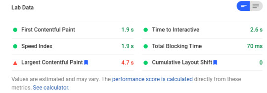
Load Times for AMP version

Load times for Non-AMP version
You can see the performance boost you get if you use AMP. And as a user, it's beneficial to you. You don't want to wait for results, you just want to get the answer real quick. And Google tries its best to find the answers for you so that you don't have to search manually.
Google even shows featured snippets for most queries so that you don't even have to open the webpage. Here's an example:

As you can see, Google tries it's very best to answer questions and make your experience faster. AMP is just a way to make it even faster for users who just want to find an answer quickly.
AMP also makes sure a page looks the same across platforms and browsers, thus removing many limitations of web design. So from a user's perspective, AMP is an absolute win.
Now let's move on to the third, and the most important perspective for our purposes.
Google, as a search engine
Before discussing this perspective, let's summarize what Google AMP really does:
Accelerated Mobile Pages or AMP as the name suggests is a way of designing web pages to improve user experience especially on mobile devices. These pages have workarounds for things that can possibly slow down a page. There are plugins for most dynamic elements like carousels, dynamic lists, forms, and embeds. The content is served from the AMP cache which, combined with preloading, creates a fast loading effect.
There is no one guide for designing a webpage. You have HTML, CSS and your creativity and a blank canvas.
That being said, there are some good artists and some bad artists. If there was a guide to how every page should be, there would be way less variation across pages.
Still, there is the concept of Semantic HTML which helps us organize our web pages.
Semantic HTML is the practice of using meaningful tags for certain parts of a webpage instead of using general <div> and <span> tags for everything. For example, using <h1> for headings, <nav> for navigation, <header> and <footer> for headers and footers, respectively.
So, using <header> is much better than using something like <div class="header">
If every web page was forced to use such conventions, search engines would easily be able to identify what the main content was and display much better results. But, you can't force everyone to use such conventions.
To simplify extracting information from webpages, Google encourages developers to use Structured Data. This is an organised form of what is present on the webpage. For example the structured data of this article is the following:
{ "@context": "https://schema.org", "@type": "Article", "publisher": { "@type": "Organization", "name": "freeCodeCamp.org", "logo": { "@type": "ImageObject", "url": "https://www.freecodecamp.org/news/content/images/2019/11/fcc_primary_large_24X210.svg", "width": 210, "height": 24 } }, "author": { "@type": "Person", "name": "Abhishek Chaudhary", "image": { "@type": "ImageObject", "url": "https://www.freecodecamp.org/news/content/images/2020/08/image.jpg", "width": 2000, "height": 2000 }, "sameAs": [ "https://theabbie.github.io", "https://www.facebook.com/abhishek.vice.versa", "https://twitter.com/theabbiee" ] }, "headline": "Is Google AMP the right choice for your website?", "url": "https://www.freecodecamp.org/news/p/efcffd53-9fa2-49ba-a144-9c627fde4d86/", "image": { "@type": "ImageObject", "url": "https://images.unsplash.com/photo-1533292362155-d79af6b08b77?ixlib=rb-1.2.1&q=80&fm=jpg&crop=entropy&cs=tinysrgb&w=2000&fit=max&ixid=eyJhcHBfaWQiOjExNzczfQ", "width": 2000, "height": 1333 }, "description": "Accelerated Mobile Pages or AMP is an open-source initiative by google. In there words the motive is to "make the web better for all". Whether it's actually true or not is highly debatable, Some critics (mostly publishers) say that this will make Google dominate the web. But we can't jump", "mainEntityOfPage": { "@type": "WebPage", "@id": "https://www.freecodecamp.org/news/" } }
Google doesn't rely on this alone, as people might misuse it. But it helps Google understand what is present on the page. These can also help in displaying rich results, for example:

Rich results for tutorial
The good thing about AMP is that it encourages developers to use structured data. Also, due to the severe limitations, the page has a much cleaner design. This makes the task of search engines much easier.
And almost everyone would agree that cleaner, faster webpages are also important in general.
So how do you decide?
In this article, we saw that AMP is beneficial to both users and Google, and can also be beneficial to publishers if they don't resist change. And everyone is a user at some point.
If you hate slow, non mobile-friendly websites, think about how other users feel, too. A cleaner internet is always better.
That being said, if your only motive is to create a clean and fast webpage, you can do so without AMP too. Just avoid unnecessary components and design efficiently.
This article was an overview of AMP, and its pros and cons. Now you know why it may or may not be useful to you. And just a note - freeCodeCamp uses AMP, and it's great. I hope you make a good decision for your site.
0 notes
Text
Let’s Make One of Those Fancy Scrolling Animations Used on Apple Product Pages
Apple is well-known for the sleek animations on their product pages. For example, as you scroll down the page products may slide into view, MacBooks fold open and iPhones spin, all while showing off the hardware, demonstrating the software and telling interactive stories of how the products are used.
Just check out this video of the mobile web experience for the iPad Pro:
Source: Twitter
A lot of the effects that you see there aren’t created in just HTML and CSS. What then, you ask? Well, it can be a little hard to figure out. Even using the browser’s DevTools won’t always reveal the answer, as it often can’t see past a <canvas> element.
Let’s take an in-depth look at one of these effects to see how it’s made so you can recreate some of these magical effects in our own projects. Specifically, let’s replicate the AirPods Pro product page and the shifting light effect in the hero image.
The basic concept
The idea is to create an animation just like a sequence of images in rapid succession. You know, like a flip book! No complex WebGL scenes or advanced JavaScript libraries are needed.
By synchronizing each frame to the user’s scroll position, we can play the animation as the user scrolls down (or back up) the page.
Start with the markup and styles
The HTML and CSS for this effect is very easy as the magic happens inside the <canvas> element which we control with JavaScript by giving it an ID.
In CSS, we’ll give our document a height of 100vh and make our <body> 5⨉ taller than that to give ourselves the necessary scroll length to make this work. We’ll also match the background color of the document with the background color of our images.
The last thing we’ll do is position the <canvas>, center it, and limit the max-width and height so it does not exceed the dimensions of the viewport.
html { height: 100vh; }
body { background: #000; height: 500vh; }
canvas { position: fixed; left: 50%; top: 50%; max-height: 100vh; max-width: 100vw; transform: translate(-50%, -50%); }
Right now, we are able to scroll down the page (even though the content does not exceed the viewport height) and our <canvas> stays at the top of the viewport. That’s all the HTML and CSS we need.
Let’s move on to loading the images.
Fetching the correct images
Since we’ll be working with an image sequence (again, like a flip book), we’ll assume the file names are numbered sequentially in ascending order (i.e. 0001.jpg, 0002.jpg, 0003.jpg, etc.) in the same directory.
We’ll write a function that returns the file path with the number of the image file we want, based off of the user’s scroll position.
const currentFrame = index => ( `https://www.apple.com/105/media/us/airpods-pro/2019/1299e2f5_9206_4470_b28e_08307a42f19b/anim/sequence/large/01-hero-lightpass/${index.toString().padStart(4, '0')}.jpg` )
Since the image number is an integer, we’ll need to turn it in to a string and use padStart(4, '0') to prepend zeros in front of our index until we reach four digits to match our file names. So, for example, passing 1 into this function will return 0001.
That gives us a way to handle image paths. Here’s the first image in the sequence drawn on the <canvas> element:
CodePen Embed Fallback
As you can see, the first image is on the page. At this point, it’s just a static file. What we want is to update it based on the user’s scroll position. And we don’t merely want to load one image file and then swap it out by loading another image file. We want to draw the images on the <canvas> and update the drawing with the next image in the sequence (but we’ll get to that in just a bit).
We already made the function to generate the image filepath based on the number we pass into it so what we need to do now is track the user’s scroll position and determine the corresponding image frame for that scroll position.
Connecting images to the user’s scroll progress
To know which number we need to pass (and thus which image to load) in the sequence, we need to calculate the user’s scroll progress. We’ll make an event listener to track that and handle some math to calculate which image to load.
We need to know:
Where scrolling starts and ends
The user’s scroll progress (i.e. a percentage of how far the user is down the page)
The image that corresponds to the user’s scroll progress
We’ll use scrollTop to get the vertical scroll position of the element, which in our case happens to be the top of the document. That will serve as the starting point value. We’ll get the end (or maximum) value by subtracting the window height from the document scroll height. From there, we’ll divide the scrollTop value by the maximum value the user can scroll down, which gives us the user’s scroll progress.
Then we need to turn that scroll progress into an index number that corresponds with the image numbering sequence for us to return the correct image for that position. We can do this by multiplying the progress number by the number of frames (images) we have. We’ll use Math.floor() to round that number down and wrap it in Math.min() with our maximum frame count so it never exceeds the total number of frames.
window.addEventListener('scroll', () => { const scrollTop = html.scrollTop; const maxScrollTop = html.scrollHeight - window.innerHeight; const scrollFraction = scrollTop / maxScrollTop; const frameIndex = Math.min( frameCount - 1, Math.floor(scrollFraction * frameCount) ); });
Updating <canvas> with the correct image
We now know which image we need to draw as the user’s scroll progress changes. This is where the magic of <canvas> comes into play. <canvas> has many cool features for building everything from games and animations to design mockup generators and everything in between!
One of those features is a method called requestAnimationFrame that works with the browser to update <canvas> in a way we couldn’t do if we were working with straight image files instead. This is why I went with a <canvas> approach instead of, say, an <img> element or a <div> with a background image.
requestAnimationFrame will match the browser refresh rate and enable hardware acceleration by using WebGL to render it using the device’s video card or integrated graphics. In other words, we’ll get super smooth transitions between frames — no image flashes!
Let’s call this function in our scroll event listener to swap images as the user scrolls up or down the page. requestAnimationFrame takes a callback argument, so we’ll pass a function that will update the image source and draw the new image on the <canvas>:
requestAnimationFrame(() => updateImage(frameIndex + 1))
We’re bumping up the frameIndex by 1 because, while the image sequence starts at 0001.jpg, our scroll progress calculation starts actually starts at 0. This ensures that the two values are always aligned.
The callback function we pass to update the image looks like this:
const updateImage = index => { img.src = currentFrame(index); context.drawImage(img, 0, 0); }
We pass the frameIndex into the function. That sets the image source with the next image in the sequence, which is drawn on our <canvas> element.
Even better with image preloading
We’re technically done at this point. But, come on, we can do better! For example, scrolling quickly results in a little lag between image frames. That’s because every new image sends off a new network request, requiring a new download.
We should try preloading the images new network requests. That way, each frame is already downloaded, making the transitions that much faster, and the animation that much smoother!
All we’ve gotta do is loop through the entire sequence of images and load ‘em up:
const frameCount = 148;
const preloadImages = () => { for (let i = 1; i < frameCount; i++) { const img = new Image(); img.src = currentFrame(i); } };
preloadImages();
Demo!
CodePen Embed Fallback
A quick note on performance
While this effect is pretty slick, it’s also a lot of images. 148 to be exact.
No matter much we optimize the images, or how speedy the CDN is that serves them, loading hundreds of images will always result in a bloated page. Let’s say we have multiple instances of this on the same page. We might get performance stats like this:

That might be fine for a high-speed internet connection without tight data caps, but we can’t say the same for users without such luxuries. It’s a tricky balance to strike, but we have to be mindful of everyone’s experience — and how our decisions affect them.
A few things we can do to help strike that balance include:
Loading a single fallback image instead of the entire image sequence
Creating sequences that use smaller image files for certain devices
Allowing the user to enable the sequence, perhaps with a button that starts and stops the sequence
Apple employs the first option. If you load the AirPods Pro page on a mobile device connected to a slow 3G connection and, hey, the performance stats start to look a whole lot better:

Yeah, it’s still a heavy page. But it’s a lot lighter than what we’d get without any performance considerations at all. That’s how Apple is able to get get so many complex sequences onto a single page.
Further reading
If you are interested in how these image sequences are generated, a good place to start is the Lottie library by AirBnB. The docs take you through the basics of generating animations with After Effects while providing an easy way to include them in projects.
The post Let’s Make One of Those Fancy Scrolling Animations Used on Apple Product Pages appeared first on CSS-Tricks.
Let’s Make One of Those Fancy Scrolling Animations Used on Apple Product Pages published first on https://deskbysnafu.tumblr.com/
0 notes
Text
Let’s Make One of Those Fancy Scrolling Animations Used on Apple Product Pages
Apple is well-known for the sleek animations on their product pages. For example, as you scroll down the page products may slide into view, MacBooks fold open and iPhones spin, all while showing off the hardware, demonstrating the software and telling interactive stories of how the products are used.
Just check out this video of the mobile web experience for the iPad Pro:
Source: Twitter
A lot of the effects that you see there aren’t created in just HTML and CSS. What then, you ask? Well, it can be a little hard to figure out. Even using the browser’s DevTools won’t always reveal the answer, as it often can’t see past a <canvas> element.
Let’s take an in-depth look at one of these effects to see how it’s made so you can recreate some of these magical effects in our own projects. Specifically, let’s replicate the AirPods Pro product page and the shifting light effect in the hero image.
The basic concept
The idea is to create an animation just like a sequence of images in rapid succession. You know, like a flip book! No complex WebGL scenes or advanced JavaScript libraries are needed.
By synchronizing each frame to the user’s scroll position, we can play the animation as the user scrolls down (or back up) the page.
Start with the markup and styles
The HTML and CSS for this effect is very easy as the magic happens inside the <canvas> element which we control with JavaScript by giving it an ID.
In CSS, we’ll give our document a height of 100vh and make our <body> 5⨉ taller than that to give ourselves the necessary scroll length to make this work. We’ll also match the background color of the document with the background color of our images.
The last thing we’ll do is position the <canvas>, center it, and limit the max-width and height so it does not exceed the dimensions of the viewport.
html { height: 100vh; }
body { background: #000; height: 500vh; }
canvas { position: fixed; left: 50%; top: 50%; max-height: 100vh; max-width: 100vw; transform: translate(-50%, -50%); }
Right now, we are able to scroll down the page (even though the content does not exceed the viewport height) and our <canvas> stays at the top of the viewport. That’s all the HTML and CSS we need.
Let’s move on to loading the images.
Fetching the correct images
Since we’ll be working with an image sequence (again, like a flip book), we’ll assume the file names are numbered sequentially in ascending order (i.e. 0001.jpg, 0002.jpg, 0003.jpg, etc.) in the same directory.
We’ll write a function that returns the file path with the number of the image file we want, based off of the user’s scroll position.
const currentFrame = index => ( `https://www.apple.com/105/media/us/airpods-pro/2019/1299e2f5_9206_4470_b28e_08307a42f19b/anim/sequence/large/01-hero-lightpass/${index.toString().padStart(4, '0')}.jpg` )
Since the image number is an integer, we’ll need to turn it in to a string and use padStart(4, '0') to prepend zeros in front of our index until we reach four digits to match our file names. So, for example, passing 1 into this function will return 0001.
That gives us a way to handle image paths. Here’s the first image in the sequence drawn on the <canvas> element:
CodePen Embed Fallback
As you can see, the first image is on the page. At this point, it’s just a static file. What we want is to update it based on the user’s scroll position. And we don’t merely want to load one image file and then swap it out by loading another image file. We want to draw the images on the <canvas> and update the drawing with the next image in the sequence (but we’ll get to that in just a bit).
We already made the function to generate the image filepath based on the number we pass into it so what we need to do now is track the user’s scroll position and determine the corresponding image frame for that scroll position.
Connecting images to the user’s scroll progress
To know which number we need to pass (and thus which image to load) in the sequence, we need to calculate the user’s scroll progress. We’ll make an event listener to track that and handle some math to calculate which image to load.
We need to know:
Where scrolling starts and ends
The user’s scroll progress (i.e. a percentage of how far the user is down the page)
The image that corresponds to the user’s scroll progress
We’ll use scrollTop to get the vertical scroll position of the element, which in our case happens to be the top of the document. That will serve as the starting point value. We’ll get the end (or maximum) value by subtracting the window height from the document scroll height. From there, we’ll divide the scrollTop value by the maximum value the user can scroll down, which gives us the user’s scroll progress.
Then we need to turn that scroll progress into an index number that corresponds with the image numbering sequence for us to return the correct image for that position. We can do this by multiplying the progress number by the number of frames (images) we have. We’ll use Math.floor() to round that number down and wrap it in Math.min() with our maximum frame count so it never exceeds the total number of frames.
window.addEventListener('scroll', () => { const scrollTop = html.scrollTop; const maxScrollTop = html.scrollHeight - window.innerHeight; const scrollFraction = scrollTop / maxScrollTop; const frameIndex = Math.min( frameCount - 1, Math.floor(scrollFraction * frameCount) ); });
Updating <canvas> with the correct image
We now know which image we need to draw as the user’s scroll progress changes. This is where the magic of <canvas> comes into play. <canvas> has many cool features for building everything from games and animations to design mockup generators and everything in between!
One of those features is a method called requestAnimationFrame that works with the browser to update <canvas> in a way we couldn’t do if we were working with straight image files instead. This is why I went with a <canvas> approach instead of, say, an <img> element or a <div> with a background image.
requestAnimationFrame will match the browser refresh rate and enable hardware acceleration by using WebGL to render it using the device’s video card or integrated graphics. In other words, we’ll get super smooth transitions between frames — no image flashes!
Let’s call this function in our scroll event listener to swap images as the user scrolls up or down the page. requestAnimationFrame takes a callback argument, so we’ll pass a function that will update the image source and draw the new image on the <canvas>:
requestAnimationFrame(() => updateImage(frameIndex + 1))
We’re bumping up the frameIndex by 1 because, while the image sequence starts at 0001.jpg, our scroll progress calculation starts actually starts at 0. This ensures that the two values are always aligned.
The callback function we pass to update the image looks like this:
const updateImage = index => { img.src = currentFrame(index); context.drawImage(img, 0, 0); }
We pass the frameIndex into the function. That sets the image source with the next image in the sequence, which is drawn on our <canvas> element.
Even better with image preloading
We’re technically done at this point. But, come on, we can do better! For example, scrolling quickly results in a little lag between image frames. That’s because every new image sends off a new network request, requiring a new download.
We should try preloading the images new network requests. That way, each frame is already downloaded, making the transitions that much faster, and the animation that much smoother!
All we’ve gotta do is loop through the entire sequence of images and load ‘em up:
const frameCount = 148;
const preloadImages = () => { for (let i = 1; i < frameCount; i++) { const img = new Image(); img.src = currentFrame(i); } };
preloadImages();
Demo!
CodePen Embed Fallback
A quick note on performance
While this effect is pretty slick, it’s also a lot of images. 148 to be exact.
No matter much we optimize the images, or how speedy the CDN is that serves them, loading hundreds of images will always result in a bloated page. Let’s say we have multiple instances of this on the same page. We might get performance stats like this:

That might be fine for a high-speed internet connection without tight data caps, but we can’t say the same for users without such luxuries. It’s a tricky balance to strike, but we have to be mindful of everyone’s experience — and how our decisions affect them.
A few things we can do to help strike that balance include:
Loading a single fallback image instead of the entire image sequence
Creating sequences that use smaller image files for certain devices
Allowing the user to enable the sequence, perhaps with a button that starts and stops the sequence
Apple employs the first option. If you load the AirPods Pro page on a mobile device connected to a slow 3G connection and, hey, the performance stats start to look a whole lot better:

Yeah, it’s still a heavy page. But it’s a lot lighter than what we’d get without any performance considerations at all. That’s how Apple is able to get get so many complex sequences onto a single page.
Further reading
If you are interested in how these image sequences are generated, a good place to start is the Lottie library by AirBnB. The docs take you through the basics of generating animations with After Effects while providing an easy way to include them in projects.
The post Let’s Make One of Those Fancy Scrolling Animations Used on Apple Product Pages appeared first on CSS-Tricks.
source https://css-tricks.com/lets-make-one-of-those-fancy-scrolling-animations-used-on-apple-product-pages/
from WordPress https://ift.tt/2WVlcvM via IFTTT
0 notes
Text
Ultimate Image Gallery (Sliders)
What is Ultimate Image Gallery ?
Ultimate Image Gallery is a full blown responsive image gallery that runs on all major browsers and mobile devices like iPhone, iPad, iOS, Android and Windows mobile or desktop.
Ultimate Image Gallery has high performance using OOP code and the latest CSS techniques, ready for mobile with swipe support, very flexible, easy to setup and extremely customizable. Packed with a huge amount of features like responsive layout, optional deeplinking, image (jpg, jpeg, png) support, unlimited playlists, unlimited playlist images, flexible skin, share etc, it makes it one of the best and complete image gallery available on sale.
Ultimate Image Gallery main features:
Responsive layout.
Mobile and desktop optimized.
Very easy to install and setup.
Four display types, responsive / fixed, fluid width, fullscreen.
Support for image (jpg, jpeg, png).
The images can have any size or format.
The playlists / content can be created using HTML markup.
Customizable theme, plus two skins included.
Customizable item border size, color, dropshadow and other visual settings can be configured with ease.
Swipe support for mobile devices and optional keyboard support for desktop.
Optional playlists / categories window.
Option to randomize / random playlists / category.
Support for unlimited playlists and each playlist can contain unlimited images.
Optional playlist / category search.
All buttons are optional and can be positioned near or outside the current gallery item, plus fine tune control for the buttons position.
API support.
Optional deeplinking (unique link for each gallery item).
Autohide buttons, the buttons can be set to autohide after a number of seconds of inactivity.
Optional and customizable small and large thumbnails. The thumbnails size, border, color, radius and other settings can be easily set.
The thumbnails are autogenerated from the original image and the size (width and height) can be specified.
Optional description window.
Image zoom button with image pan support (optional).
Slideshow button and slideshow animated preloader plus customizable slideshow time delay (optional).
Facebook share button (optional).
Lazy loading.
Next and previous buttons (optional).
Fullscreen button (optional).
Hide or show thumbnails button (optional).
Hide or show playlist window (optional).
Detailed documentation and sample files.
Many other features…
What our clients are saying:
Tags: thumbnails, gallery, portfolio, media, slideshow, jquery gallery, lightbox, masonry, photo gallery, portfolio, responsive, thumbnail pictures, showcase, team
from CodeCanyon new items https://ift.tt/2GEG9ok via IFTTT https://goo.gl/zxKHwc
0 notes
Text
Smaze - Multipurpose Modern Theme
New Post has been published on http://wpelegant.com/smaze-multipurpose-modern-theme/
Smaze - Multipurpose Modern Theme

Smaze – Multipurpose Modern Theme http://themeforest.net/category/wordpress/corporate/business
Smaze ? is a Responsive multipurpose material design WordPress Theme. It?s perfect for any creative agency, personal or business portfolio website with professional, clean, and modern style. It?s easy to use and looks great for any device.
This Theme is use Page Builder, it makes you feel free to choose appearance that you like. It helps you to present your resume, portfolio, business or any other purpose website. You can make anything you want. Smaze is also responsive and looks suitable in any kind of devices.
Video Tutorial

The Demo Site


SiteOrigin Page Builder
Page Builder will let you built your own layout within few second. Easy to customize and save your time.

Live Customizer
Live preview your theme skin customizations as you make them so you can get the exact look you want.

Slider Revolution ($18 SAVED)
All-purpose slide displaying solution for showing almost any kind of content with transition, effect and animations.

One Click Import Demo
This theme support one click import demo content. You can make your site as same as our demo site.

Powerful Admin Panel
With our extensive Options Panel you can change overall website.

Fully Responsive
What ever you are using the device your site will run as it should be. Fully responsive layout for all type of devices.

Nice Support
Whatever you level of expertise, our experienced support team are here to help you with any questions you have.
Typography
Include over 600+ Google Fonts, take a full control of typography setting for every single element.

Well Ducomentation
We have prepared a complete documentation to help get things going.

SEO Optimized
Build with best SEO practices in mind and work perfectly well with the most common SEO Plugins.
What Client Say

SMAZE Feature
Responsive Design
Unlimited Color ? easy to change up the look of Smaze with a few click with Live Customizer
SEO Optimized
Sample Content Included
600+ Fonts Google Font
Icon Ready – Font Awesome Icon
Logo Upload Option
Header Logo
Footer Logo
Header Type Choice
Transparent
No Transparent
Show/Hide Page Title – Also can add hero background
Typhography Option
Post Type
Standard
Team
Portfolio
Page Template
Default Template
Contact Template
Portfolio Template
Portfolio Grid Template
Saving $18 with Revolution Slider
One Click Import Demo
SiteOrigin Page Builder
Author Block
Button Block
HTML Block
Headline Block
LatestBlog Block
Partner Block
Portfolio Block
Pricing Block
Process Tab Block
Service List Tab Block
Service Tab Block
Skill Block
Slider Block
Feature Block
Stats Block
Team Block
Testimonial Block
Title Style 2 Block
Toggle Block
Changelog Version 2.3 29 June 2016 UPDATED : ACF Pro Plugin to 5.3.9.2 UPDATED : Revolution Slider Plugin to 5.1.2 UPDATED : Demo content importer File Changed: - plugins/advanced-custom-fields-pro.zip - plugins/revslider.zip - plugin/smaze-extra.zip
Changelog Version 2.2 14 April 2016 FIXED : Layout broke REMOVED : Animsition effect and function ADDED : Preloader use image option File Changed: - inc/option/panel/config.php - js/main.js - js/plugin.js - css/plugin.css - header.php - header-no-transparent.php - style.css
Changelog Version 2.1 29 March 2016 - UPDATED : ACF Plugin to 5.3.6.1 - UPDATED : Revolution Slider Plugin to 5.2.3.5 - ADDED : Portfolio support multiple categories File Changed: - plugins - template/portfolio-template.php - template/portfolio-grid-template.php - inc/widget/portfolio-widget/tpl/base.php
Changelog Version 2.0 16 November 2015 - CHANGED : Redux Framework options to to plugin - UPDATED : ACF Plugin to 5.3.2.2 - UPDATED : Text Domain Language - FIXED : Some bugs fixed - UPDATED : Smaze Extra Plugin - CHANGED : Contact map from google maps to textarea File Changed: - style.css - functions.php - inc/option - class-tgm.php - class-tgm-plugin-activation.php - inc/function/akmanda-customizer.php - inc/option/config.php - plugins/smaze-extra.zip - template/contact-template.php - inc/function/meta-box.php
Changelog Version 1.4 31 August 2015 - CHANGED : ACF Meta Box as Plugins ACF - FIXED : WP_Widget Error File Changed: - inc/acf - style.css - latest-thumb.php - class-tgm.php - functions.php
Version 1.3 13 August 2015 - UPDATED : class TGM activation to 2.5.2 - UPDATED : class TGM plugin installer to 2.5.2 - UPDATED : Redux theme option core to 3.5.6.1 - UPDATED : Contact Map Color - ADDED : ACF to child theme File Changed: - inc/option/core - class-tgm-plugin-activation.php - class-tgm.php - js/plugin.js - style.css
Version 1.2 12 May 2015 - ADD: sticky header - FIX: some responsive bugs File changed: - inc/option/panel/config.php - style.css - css/responsive.css - widget/latestblog-block/tpl/base.php - js/main.js
Version 1.1 - FIX: some code - UPDATE: RevSlider
49
Check WordPress Theme
0 notes
Link
According to Google, the perception of the loading speed of a webpage, its display, the actual loading speed, and the website’s fluidity are some of the most important criteria of the user experience. Whether good or bad, it has a significant impact on user engagement and satisfaction. The better the perception, the better the website’s performance. In this article, we’ll see how to optimize the perception of speed and fluidity of a mobile website.
Oddly enough, the perception of the speed can be perceived differently depending on the situation and state of mind of users. Some people will feel that the website is loading longer than it actually is. For others, it will be the opposite. From a point of view based on facts, it appears that most people react the same way to the speed and responsiveness of a webpage. The longer the speed, the greater the chances of leaving the website. Keep this figure in mind: 53% of users abandon a website if the loading time exceeds 3s. Simply put, Google determined a direct correlation between the perception of the loading speed and interest in viewing a webpage.
Here are 11 tips to optimize the speed of your website.
Optimize the Content and Visual Appeal of Website Opening
It’s a very common practice on e-commerce websites. Actually, 74% of the time that people spent on a webpage was due to what they see in the first two screenfulls, the Norman Nielsen Group study recently found. Optimize the code of a page in order to display in priority what will be immediately visible on the screen. Working on this optimization requires a lot of technical knowledge and fine-tuning of the code.Enter your text here…
Activate the “Tap“ More Quickly
With the aim of overcoming the impatience of users, allow them to be able to activate the “tap” more quickly. By default, there’s a delay of around 350ms which always follows a “tap” (a touch of the screen with your fingertip). This delay exists so that the screen can possibly receive a “double-tap”, but given that this function isn’t systematically necessary, maybe you should try to remove it. This can be done very simply by modifying the code of the page, which for most browsers is: <meta name=’”viewport” content=”width=device-width”>. A job of <meta> viewport element is to give the browser instructions on how to control the page dimensions and scaling. The part named width=device-width sets the width of the page in order to follow the screen-width of the device. By implementing this code, you’ll achieve the expected result.
Make Users Active
Google has separated users into 2 types: passive and active. It’s essential to turn the “passive” ones into “active”. The former tends to percept the webpage speed and website responsiveness slower by 36% compared to what it really is. Going into the passive state is triggered by long waiting times which can be reduced, according to Google. Several techniques exist to combat this perception:
Viewing a small video game or interactive animation during a processing time is a good way to keep the user active.
Animate your feedbacks: feedbacks are signals sent by the system to show that it has responded well to the user’s request. Often, these feedbacks don’t appear quickly enough and leave users impatient. However, thanks to the CSS, it’s simple to create mini-animations that will transform the feedback into a moment of visual pleasure and reactivate users.
Lease Quality Hosting
The speed of a website is pretty much influenced by the quality of the server and hosting that you use. Therefore, you need to use a hosting that’s fast and reliable if you want to make a mobile-friendly website. We recommend you to use MySQL hosting for better performance. It offers the fast server response speed which is the most influential thing that affects your website’s loading speed. It’s proven that MySQL database will be fast if it’s in Amazon Web Services (AWS) cloud: server is of good capacity and tables are indexed and optimized. AWS supports MySQL in numerous ways, including a fully managed database service – Amazon Relational Database Service (RDS) for MySQL, which is on its hand an open-source relational database management system.
Anticipate the Completion of a Page With Progressing Images
Another technique to give users the impression of fluidity is to start showing interface elements before they are fully loaded. It’s an old web technique that has come back into fashion with the arrival of mobile phones. Progressive images are images compressed with an algorithm (like .jpg) which loads the image in successive layers. Yes, these are similar to old pixelated images (which were the subject of jokes earlier) but that became more refined over time.
Use Upbeat Design
Upbeat or “optimistic“ design is a slightly daring design technique which consists of presenting unfinished tasks as finished. Its advantage is that it gives users the impression that the task was successfully executed immediately when in reality it’s postponed. That’s exactly what Twitter does, for example. When you like a tweet, this action isn’t stored directly in the database but a few moments later. This allows not to slow down the user’s “flow” while taking into account an action that requires a request time.
Use Upbeat Download
Even better than the optimistic design is an “optimistic“ download. Rather than making users wait for the download of a file, make them believe that the file has been almost immediately downloaded and let them continue doing what they have to do next. This technique can be performed using Web Workers which consists of JavaScript scripts that execute scripts from the HTML page in the background. Obviously, this assumes that users don’t leave the page too quickly and that they are informed if the download fails.
Create Fluid and Optimized Animations
For an animation to be perceived as completely fluid, each image mustn’t appear in more than 16ms, which means that a good animation must be set at 60img/s. It’s the most important thing to take care of in regard to this step but it’s not the only one. Keep in mind that a lot here is a question of the user’s psychology, as we said at the beginning of this article.
Adopt a Collaborative Design Strategy
Optimizing speed perception seems to essentially be optimizing the work on codes but it’s not completely like that. It’s essential to make UI/UX designers aware of these problems very early on. Forcing them to think in terms of performance will make them consider their contribution to the project in another way and participate in an overall performance, which also affects the business performance of a website.
But, to achieve this, it seems necessary to create a web performance budget to make your websites as fast as a rocket. The web performance budget is a set of constraints that you’ll be able to apply to your pages according to your target users and devices they have. For this, we suggest you to visit performancebudget.io and calculate the budget yourself. Also, there’s a more and more popular testing platform – Ezoic, creating the top-notch speed accelerator that guarantees to improve your mobile website speed.
Use Best Practices From Apps
Real apps (developed for iOS and Android) contain good practices that can sometimes be useful to reuse to further improve the perception of the website’s fluidity.
Loading progress bar when a website is displayed in full screen. If you use some app, such as the Progressive Web App, that allows you to display a website in full screen, the browser buttons will no longer be displayed. For this reason, make sure to display loading bars that compensate for this lack and which, if they aren’t present, can result in bad user experience.
Continuity of loading using skeleton templates. Usually, when the user clicks on a button, the page remains displayed statically until the content of the next page has started to be sent. It can be extremely annoying for the user. To avoid this effect, always try to give the impression that the structure of the website is stored entirely on the used server and that only the new content is downloaded on each request. Skeleton templates will simulate this impression. Before downloading the final content of the page, display them first.
Untimely page breaks. You surely know these untimely page breaks when you download a page and as the images appear, the whole page jumps? This is due to the fact that the size of the images hasn’t been included in the HTML code, which describes it and must be “guessed“ by the browser when the image is actually downloaded, causing this notorious, untimely page break.
Optimize and Prioritize CSS and JavaScript Scripts
Non-optimized CSS and JavaScript scripts don’t, a priori, pose a problem for the fastest computers with a good Internet connection. On the other hand, this is not so much true on less advanced machines with slower connections, especially on mobile phones. The scripts take time to download and time to compile. On some old devices, this can cause a page activation time of more than 19s, so this is a crucial point to consider carefully. There are several valuable tips on this matter:
Download only the minimum code required. Cut your JavaScript and CSS code into blocks and, in some cases, only download the absolutely necessary blocks.
Preload the critical items on the page. To do this, use the <link rel=”preload”> tag and decide which media should be downloaded first.
Embed the most essential CSS code on your page directly in the page header.
via ITechAja
0 notes
Text
What are the best open source app development software solutions?
The age of smartphones has led to mobile apps being developed. Ios apps flourish today, whether for personal use or business purposes. The market has become highly competitive with the production of more and more smartphone applications daily. This the rivalry has led to a quicker and better choice of the right platform for apps.
Consider the mobile app development frames and features which are essential for open source testing. This will encourage you to think when you decide to create a stunning mobile app development companies in Sydney:

BuildFire.js
BuildFire.js is a cross-platform library used on the BuildFire platform to develop custom features. It allows unrestricted personalization of JavaScript only and is one of the easiest frames to implement. Using the existing features of BuildFire.js gives developers the opportunity, by leveraging any existing 45 + open-source plugs, to shorten 80 per cent of the app development phase and concentrate simply on the personalised feature required.
Have a Look- How AI And VI Are Reinventing Mobile App Development
Framework 7
Framework 7 used to be just iOS, but now also offers Android support. If you want to develop an app that even on Android looks and feels like a clean iOS app, then Framework 7 is for you.
As long as you already have decent knowledge of HTML, CSS, and JavaScript, it is also very easy to understand. Some of Framework 7 's features include Material Design UI, a custom DOM library, 1:1-page animation, native scrolling, and preloading and caching XHR.
Ionic
Ionic is another best free, open-source mobile application development software often used for hybrid app design. The best thing is that it allows you to create multi-platform apps, including Android app development company in Australia, iOS, and web — using a single codebase.
Moreover, it offers intuitive UI components that speed up the process of creating an app. Moreover, it can practically be deployed anywhere. Ionic boasts more than 120 native device features, predefined elements and a wide developer community.
jQuery Mobile
Currently over half of all mobile websites use jQuery mobile. It's one of the oldest mobile software tools out there, and has more features than others. The "Swiss army knife of mobile app dev software" has been named.
Although jQuery brings all the well-known JavaScript features to the table, the key responsibility for CSS and HTML lies with the 'Mobile' portion of the upgrade. Although it lacks native-like features or advanced UI, it does compensate for this by being as similar to the dream of "write once, run anywhere."
Mag+
Mag+ is a nifty SDK software that enables developers to build on top of their core components, saving tonnes of coding hours. They also have an iPad app that provides a fast and easy publishing platform to create content that is optimised for mobile use, no code needed.
Xojo
Xojo is a Mac OS X, Microsoft Windows, x86 Linux, iOS, Raspberry Pi and the Web development platform. They also allow you to build native apps and offer Xojo Cloud for fast, stable, and maintenance-free hosting of web apps.
Xamarin
Xamarin is a Software corporation owned by Microsoft. You can build Apps for Android, iOS and Windows with C # codebase. One of the best features of Xamarin is that it enables code sharing in different platforms (aka the creation of mobile applications around the platform). Xamarin also has a cloud service which enables you to test on a variety of devices.
Wrapping Up
The impact of IoT and its large reach has become the engine behind mobile app growth. Instead of downloading software, the Instant Software idea is emerging as a ground-breaking step in the area of app creation today.
In the coming era of Top mobile app development company in Sydney software programmes the low-code method will be in tremendous prevalence. Because of strong demand for premium content, almost all content are continually updated and optimised. App development is rising large and so are the technical solutions for the application growth. So go ahead and choose the one that will suit your needs.
Source page-What are the best open source app development software solutions?
#mobile application development#Android App Development Companies In Australia#Mobile app development companies in Sydney
0 notes
Photo

12 Best CSS Animations on CodeCanyon
In the past few years, browsers have come a long way when it comes to supporting newer CSS properties that allow developers to create nice effects and animations using just pure CSS.
There is a lot of browser support for using different transitions and keyframe animations in your projects now. You no longer have to rely on JavaScript libraries to add basic animations.
Animating different elements on a webpage is now easier than ever. However, it can still be very confusing or daunting for absolute beginners. In this post, we will cover some of the best CSS animation libraries on CodeCanyon that you can use to add fancy CSS animation to your webpages today.
CSS Animations and Effects on CodeCanyon
If you head over to the CSS Animations and Effects section on CodeCanyon, you will see that there are currently over 140 different libraries related to CSS animations.
New libraries are added periodically to the collection and you can select one from the best sellers or apply your own filters to fine tune the results.
There are libraries to animate all kinds of elements or apply different kinds of effects to elements like buttons.
12 Best CSS Animations Libraries (on CodeCanyon for 2020)
CSS3 Image Hover Effects
The first one on our list is CSS3 Image Hover Effects. You can use it to add around 17 different kinds of image hover animations.
This includes basic effects like fading and sliding overlays as well as more advanced animations like splitting overlays and joining overlays. Other interesting effects include image levitation on their shadow as well as image stacks.
Visit the description page to know more about the library. The included video on the description page shows all the animations in action.
SolidEffects—CSS3 Image Hover Effects
The SolidEffects CSS3 animation library is perfect for people who want to add truly unique image hover animations to their websites.
There are over 150 pure CSS based animation effects that look fantastic. They will definitely help you grab the attention of your visitors.
The image hover effects generally fall under following categories:
image integration effects (horizontal and vertical)
image dispersion effects
venetian blinds effects
slide and sweep effects
fold effects
zoom effects
blur, saturate and mosaic effects
Each of these animation categories include multiple animation effects that animate the overlay with different speeds in directions.
The customization is really easy because the downloaded product include LESS files to quickly change different aspects of the animation like the overlay color.
CSS3 Image—Text Hover Effects
The CSS3 Image—Text Hover Effects library is ideal for people who want to use a combination of image hover effects with some text effects.
There are 8 standard background animations that you can use with 14 different text effects. You can also combine multiple animation effects to show them on a single hover.
There is an option to choose between light and dark overlays for images to blend with your website theme.
Images can be displayed in 8 different types of boxes. This includes full-width images as well as image thumbnails.
Make sure you check out the live preview on the description page to see all the nice animations in action.
CSS3 Mega Tooltip Animation Pack
This CSS3 Mega Tooltip Animation Pack offers a great solution for people who want to integrate nice animations with different tooltips on their website.
The animation pack comes with 10 different tooltip animations. There are 8 different predefined color options. However, you can change the CSS files to add your own unique colors.
There is support for all major browsers. You can even support browsers as old as IE8 with a fix included in the download files after purchase.
The download files also contain detailed documentation and HTML samples that illustrate how to use the animation pack effectively.
tFigure—Image Captions
The tFigure—Image Captions library offers five different hover animations to display image captions.
You can use them to show nicely animated captions for different images. The overlays for each animation are available in four different colors.
The animations themselves are pretty simple. However, the way in which the captions are laid out on the overlays makes them very attractive.
These animations are framework independent so you can install them on any website you want. They are also easily customizable so you can make sure that the color scheme of the overlay matches the theme of your website.
Check out the animation's live preview page to see the awesome image caption animation in action.
Animated Loaders Kit
There are a lot of times where users might have to wait a while for a process to complete. This might be a very large image that has to load or some other computation process that needs to complete.
If the process takes a couple of seconds, it is a good practice to let users know that you are working on it. A good way to do that is with simple animated loaders.
The Animated Loaders Kit is perfect for this situation. It comes with 10 CSS-only animated loaders.
There are many advantages of using these pure CSS based animated loaders. They are easy to customize. It will change only a couple of minutes to change the color, font and size of the loaders. You can also change the animation speed. They have a very small file size compared to using GIF files.
The best way to appreciate how nice they are is to see the live preview on from the description page.
Image Hover Effects Collection
This Image Hover Effects Collection kit was added fairly recently to CodeCanyon and comes with 20 different animation styles.
They follow a responsive design philosophy and support all major browsers. So you can be rest assured that any effects you use on your website will look good on all devices and all screen sizes.
The animations are also fully customizable and you can easily change the overlay and text colors for all animations to better align them with the overall theme of your own website.
The code is well documented so it would be easier to make changes whenever necessary. You should definitely check out the live preview to see how good these hover animations are.
Dex Preloader Kit
This Dex Preloader Kit also contains over 30 different preloaders that you can easily integrate in your projects.
They are completely different in style from the Animated Loaders kit we covered above. For instance, these ones are created using a single background color. You can easily change this preloader color to the dominant color on your website.
The animations are also different and the preloaders use a variety of shapes like circles, squares and lines to create the animation.
You can also add a little bit of text under each preloader to let users know what is going on in the background.
This kit was also added fairly recently to CodeCanyon and has a lot of offer for a very low price.
Free CSS Animation Libraries for 2020
Generally, you can expect these paid CSS animation libraries to have a lot of variety in the animations compared to free alternatives. They also come with free support for six months and lifetime updates.
Many times, these premium libraries also support old browsers. However, this might not be the case with free animation libraries.
It might be easier for anyone who is just starting out to simply use these paid libraries. However, if you don't have the budget to purchase these paid plugins, we have also listed some free alternatives below.
Here are four free CSS animation libraries that you can use in your projects:
image hover.css
This library gives you the option to add simple image hover animations from different directions. It comes with 40 different hover animations.
SlipHover
This is also a free image hover animation library. However, it only comes with basic sliding animations.
The unique features of this library is that the hover animations are aware of the cursor direction. So, the overlay will appear to move in from the left side if the user hovers over the image from the left side.
animate.css
This animation library is not aimed at a specific use case like image hover animations or tooltips.
It is simply a general purpose library that you can use to animate different elements on a webpage. There are a bunch of classes that you can add to different elements to control the speed and delay of the animation.
loaders.css
This library consists of pure CSS based loading animations. You can use them in your project if you are looking for some nice preloader animations.
Additional Resources
It can be hard to figure out where to start for an absolute beginner. We are listing some tutorials here which will make it easier for you to understand how CSS animations work and how you can start using them in your own projects.
You should start by reading this tutorial that provides a beginner level introduction to CSS animation. After that, you should consider learning how to use CSS variables for animation.
Using different pre-built CSS animation libraries is not hard at all. However, having a basic understanding of the concepts will go a long way when it comes to making changes to these animations on trying to create something of your own in future.
You should also consider reading these two tutorials that teach you how to create your own CSS based animations for scratch. The first tutorial is for basic hover effects while the second one is a quick tip for page loading animations.
A Beginner’s Introduction to CSS Animation
In this tutorial I am going to introduce you to CSS animations; a highly performant way of animating on the web which is becoming more and more popular as...
Catalin Miron
03 Jun 2014
CSS Animation
How to Use CSS Variables for Animation
Not only are CSS variables a real and tangible option for developers, they can also be used in animation scenarios. Still skeptical? Follow along to find out...
Dennis Gaebel
22 May 2017
Animation
How to Create 7 Different CSS Hover Effects From Scratch
In today’s tutorial, we’re going to create 7 different CSS hover effects. We’ll learn loads along the way, including how to animate font icons, borders, and...
George Martsoukos
14 Nov 2019
CSS
Enhance the Way a Web Page Loads With CSS Animations
In a previous tutorial we created a full-screen responsive page with flexbox. Today, we’ll make this page more attractive by adding a few CSS animations to it.
George Martsoukos
11 Dec 2018
CSS Animation
Final Thoughts
Using a bit of animation for different elements on your website can make the content more interesting and engaging.
Coming up with our own unique animations from scratch can take some time. So, we listed some of the best free and premium CSS based animation libraries that will help you get started in no time.
New animations and effects are added all the time to CodeCanyon—you can choose from from one of the best sellers or try something fresh and new.
by Eric Dye via Envato Tuts+ Code https://ift.tt/38Y7POB
0 notes